
Components
This page lists all components available across the entire City Nature Challenge site and provides examples and descriptions.
Accordion List
A collapsible set of title text and paragraph description. Designed for use in the FAQ section.
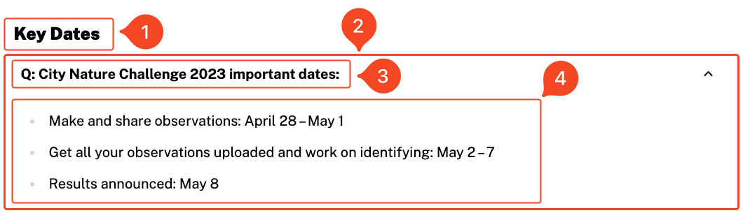
- Title: Header for the accordion list section.
- Accordions: List of individual accordions (one of which, an Accordion, is displayed in the image above).
- Title: Title of accordion component.
- Description: Description paragraph that will be hidden until expanded.
Alert
Alerts are admonitions/callout boxes meant to draw the attention of users, often with important information.
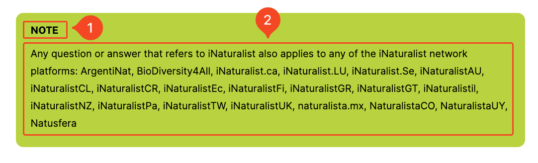
- Title: Bolded text at top of alert
- Description: Paragraph text under title.
Contact Form
Contact forms were specifically developed for the Contact page. The only fields you can configure is “Email Recipients”, a list of emails that determine who the contact email will be sent to.
Countdown
The Countdown component is only available on the Home page and countdowns to the start of the identification stage of the City Nature Challenge. When the City Nature Challenge starts, it displays a link to the Current Results page.
 Countdown when the City Nature Challenge is live (above). Countdown when the the City Nature Challenge is not live (below):
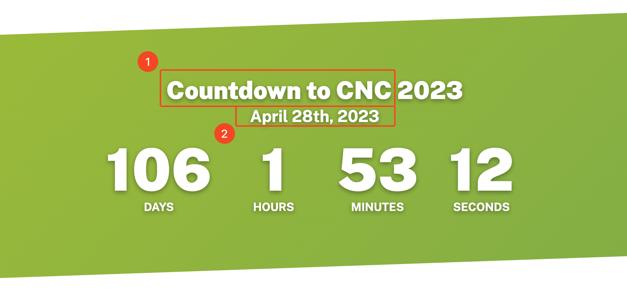
- Title: Title text with exception of the year (which is taken form event dates)
- Event dates: Relation to an Event Dates year entry
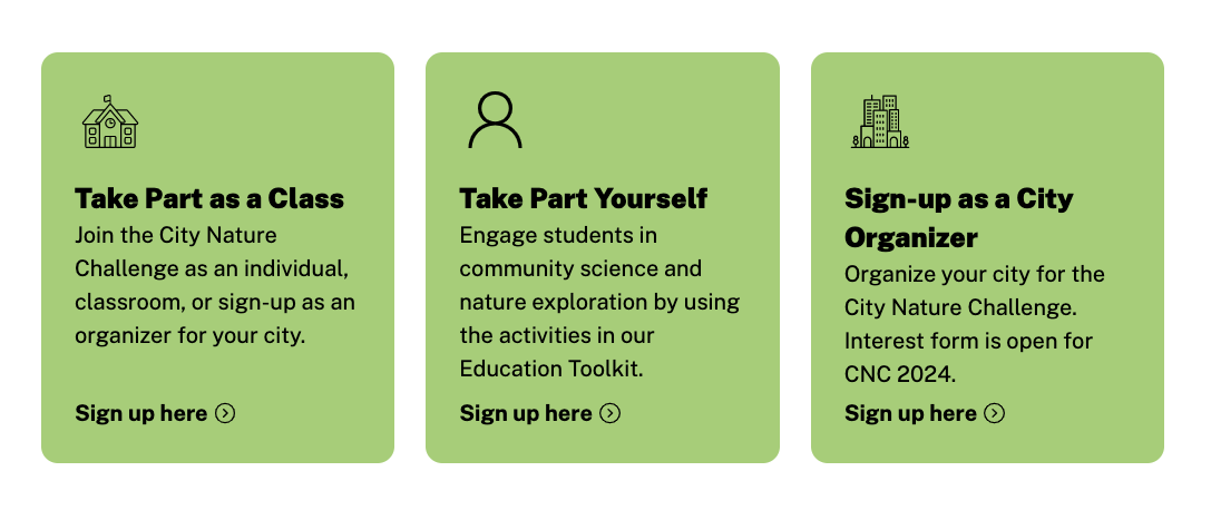
CTA Row
A CTA Row places multiple CTAs horizontally, placing them on the same row (see below for examples). A maximum of three CTAs may be placed in a CTA row. 
- Title: Title of the CTA row (not required).
- Icon: Optional icon for the CTA. It is suggested you use an .svg suggested for the icon.
- Title: Title for the CTA (required).
- Description: paragraph text below title.
- CTA: Button text (will always be placed before an arrow icon).
A CTA component has three more fields:
- Color: if set to FALSE, it will be rendered with a black outline instead of site colors
- URL: an external URL that the CTA links to
- Internal Page: an internal page that the CTA links to
If both the URL and Internal Page is filled out, the CTA will by default link to the internal page.
A CTA row with two CTAs and Color set to False: 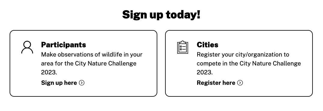
A CTA row with three CTAs and Color set to True:
Events List
An Events List is a collection of Event instances in a vertical list. This component functions very similar to the Publication List.
Event date/times do not display according to the users local time.
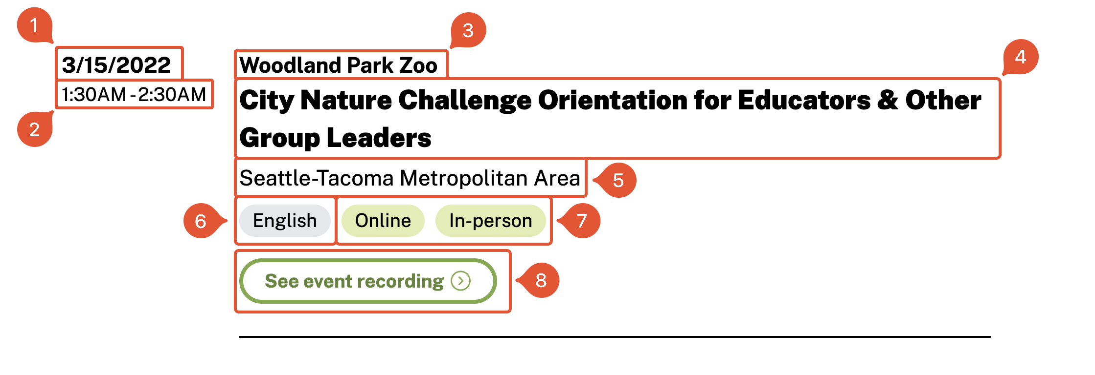
- Date: Date the even occurs.
- Start/End Time: Start and end time of event. This will display according to the users/browsers local time.
- Organization: Organization/group that is organizing the event.
- Title: Name of the event.
- Location: location of event.
- Languages: languages the event is available in.
- Type: Online/In-person (can be both).
- Link: URL to event recording/event details
Home Paragraph
Like all Home components, this is only available on the home page. 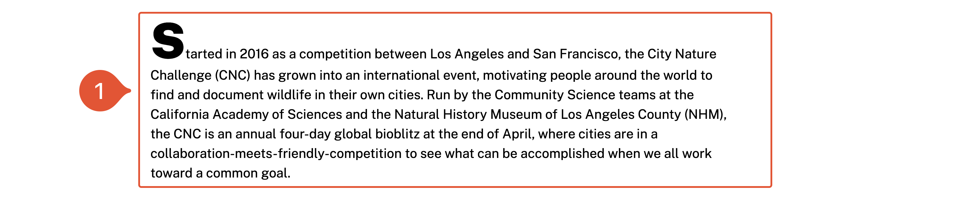
- Text: Long text paragraph for home page. The Home Paragraph component has an oversized capital on the first word of the paragraph.
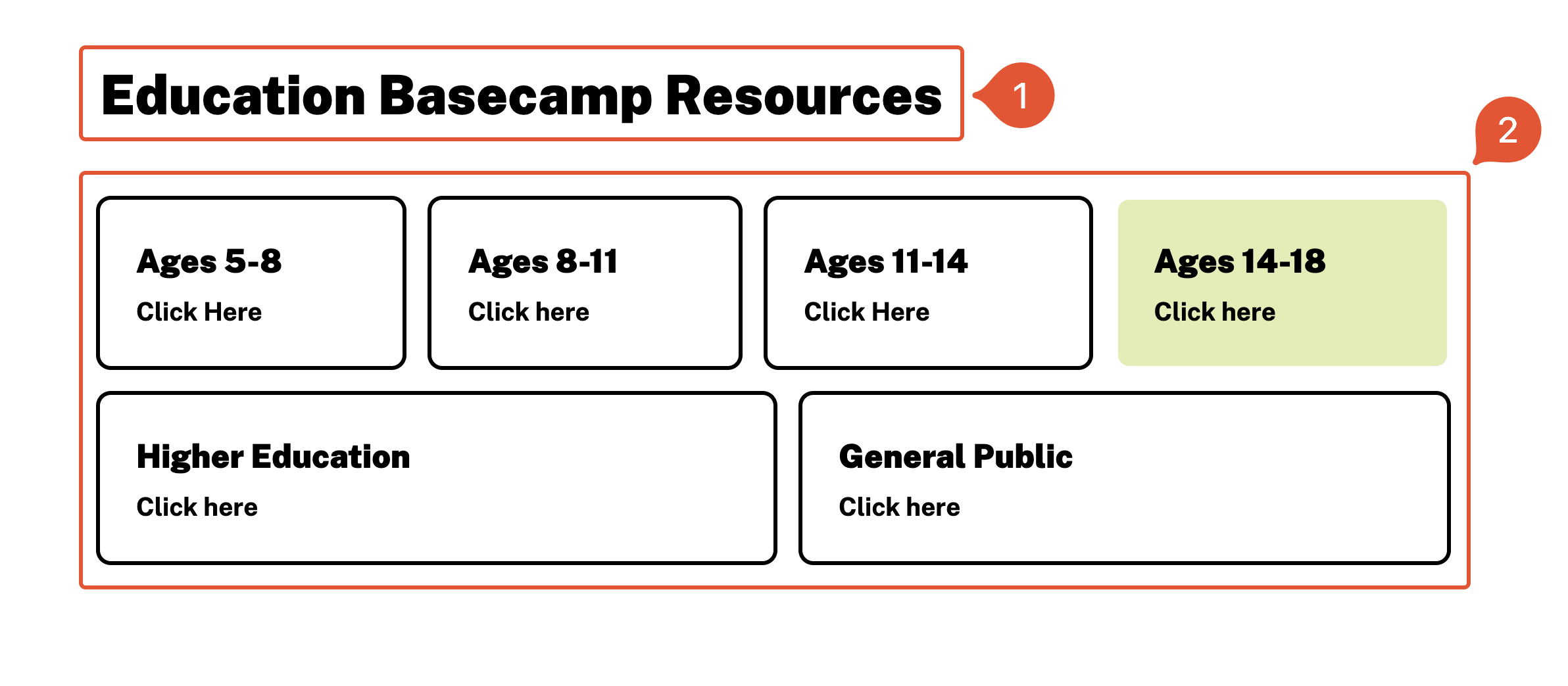
Home Parts
Like all Home components, this is only available on the home page. The title text, with the exception of the year, is not editable. Please send a request to Digital Strategies if you’d like to edit the title text or change other formatting (such as the the title text or images).
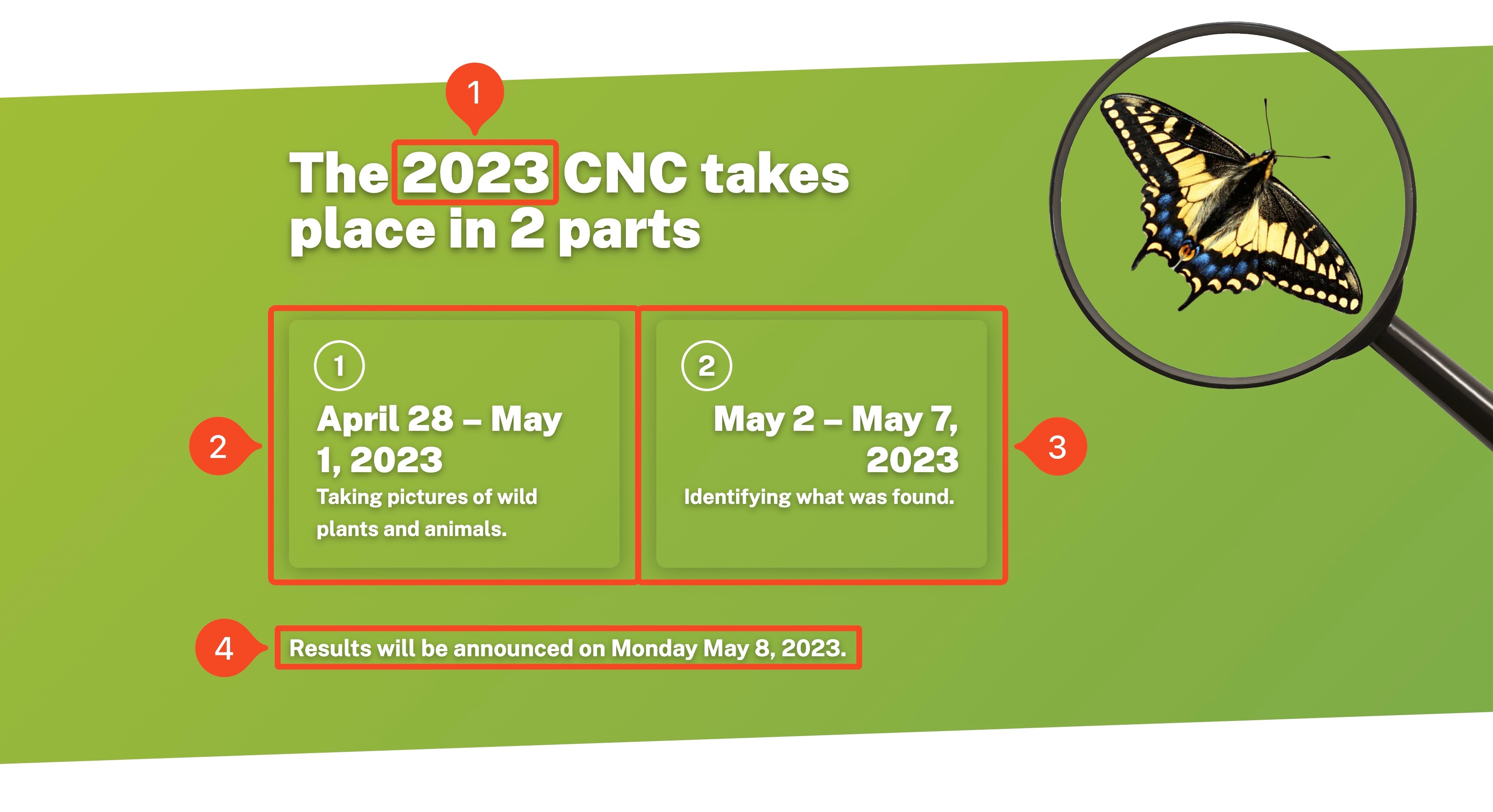
- Year: Year that the CNC is taking place (the text around it cannot be edited due to its unique formatting).
- Part 1: The first phase of the City Nature Challenge (i.e. collection).
- Part 2: The second phase of the City Nature Challenge (i.e. identification).
- Text: Text of the of the Home Parts block — usually reserved for the date the results will be released.
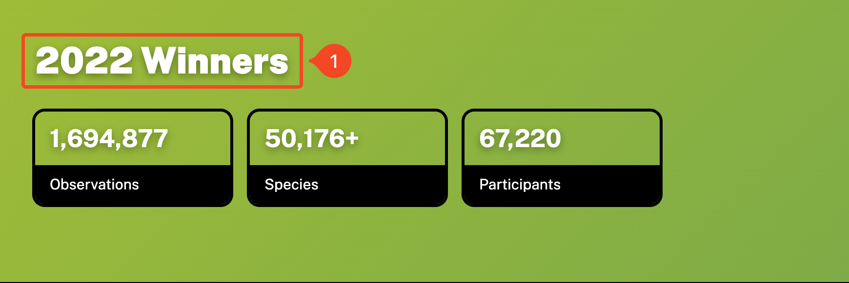
Home Results
The Home Results component displays results of a past year of the City Nature Challenge from the Results collection.
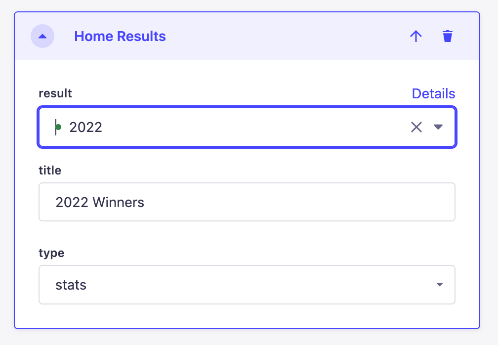
To change the year that the Home Result component is pulling from, use the Result dropdown and select the entry from the Results collection. The Type field determines if the component should be rendered as a Winner component or Stat block.
The selected year from the Results collection should have a component matching the Type field in Home Results. For example, if the result is set as 2022 and type as stats, then the 2022 Results entry should contain a Stats component.
1. Title: Text for title.
In the example above, the year 2022 is chosen and the type set to stats.
Icon Row
An Icon Row is a horizontal series of Icons components, which are photos and their paired descriptions and optional links.
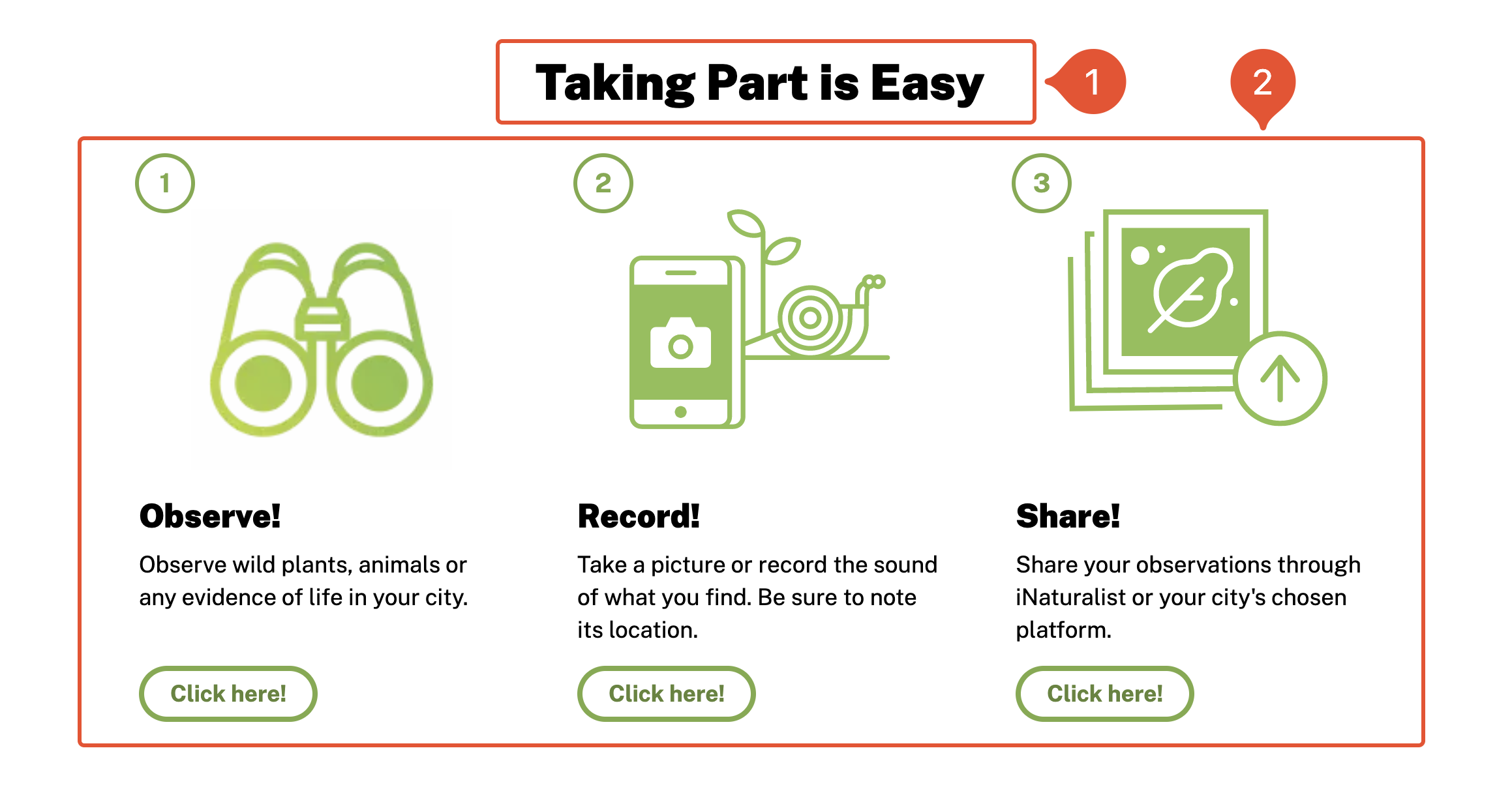
- Title: Title text for the Icon Row (optional).
- Icons: Series of Icons (three maximum).
While an Icon component can accept any kind of image, its highly recommended to use and SVG for the icon field.
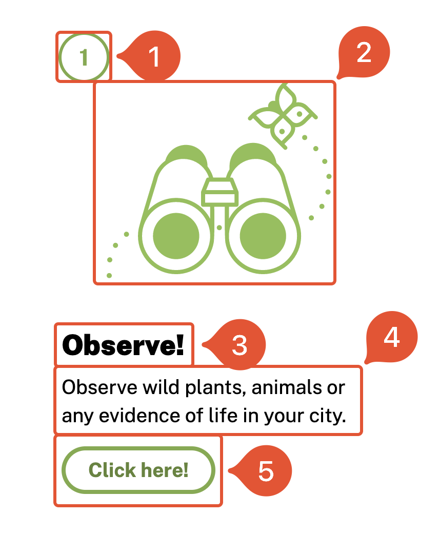
- Numbered: If set to TRUE, Icons will be numbered by order in the Icons section (optional).
- Image: The image displayed for the Icon, it is high recommended to use an SVG (optional).
- Title: Title text for the Icon (required).
- Description: Paragraph text underneath the title (required).
- Link: A button that links out to a specified URL (optional).
The Icon component also has the following field:
- Justification: shifts the justification of the Icon text to the left or centered.
Link Row
A Link Row is a horizontal series of Link components. A Link component is a more visually appealing way to dipay a URL and related text, similar to a button.
- Title: Title text for the Link Row (optional).
- Links: Series of Links.
Below are the fields of a Link component:
- Title: Title text of the Link component.
- Label: Text for the button.
The Link component also has the following field:
- URL: The URL of the link.
Map
Interactive map component that brings in layers from ArcGIS Online. For information on how to bring cities into ArcGIS, please refer to the Adding a map documentation. They were designed for the Cities list but can ingest any Feature Layer with points.
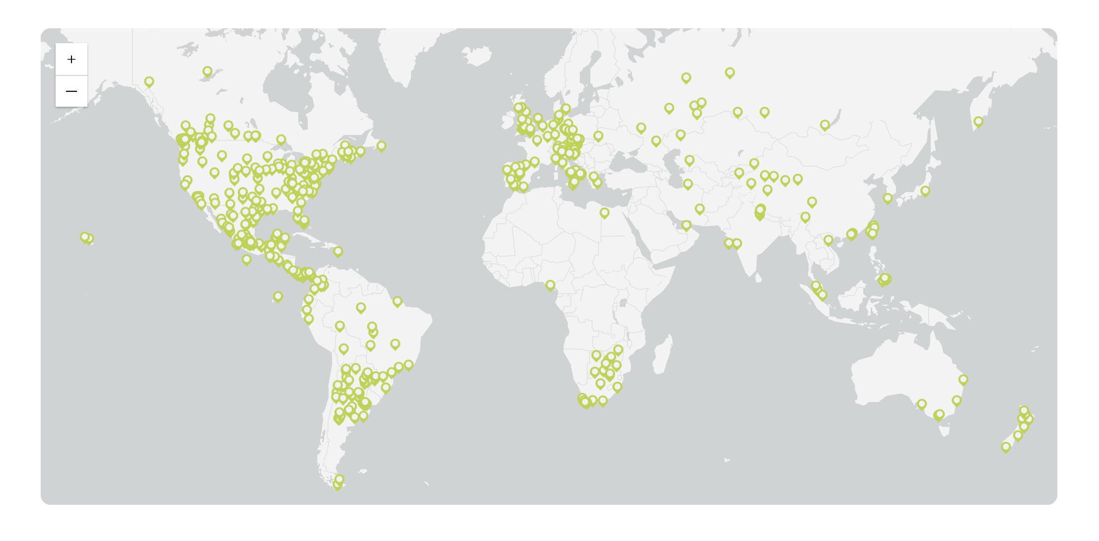
Below are the Map component’s fields:
-
Title: The header text displayed above the map (optional).
-
ArcGIS Layer ID: The portal ID of a layer refers to a Feature Layer’s ID on ArcGIS Online. The easiest way to find a portal ID is in a feature layer’s web page in its URL (as shown below, highlighted):

Publications List
An Publications List is a collection of Publication instances in a vertical list. This component is very similar to the Events List. Designed specifically for the Press & Publications page.
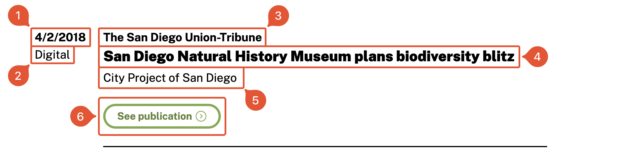
- Date: Date in which the publication was published.
- Type: Digital and/or print.
- Organization: Publisher of the publication (required).
- Title: Title of the publication (required).
- Project: Project associated with publication.
- Link: URL of the publication (optional).
Results
Renders all selected entries from the Results collection. A dropdown allows the user to select a specific year and see the rendered results. Designed for the Past Results page.
The only field the Results component contains is:
- Results: List of years from the Results collection to display and made available in dropdown.
Stat Row
Horizontal series of Stats, boxes of a statistic and their label.
- Title: Title text of the row
- Stats: Series of Stat components
- Stat: The numeric statistic to display (required).
- Label: The statistic description (required).
Table
A table derived from a JSON file. Developed with the Results collection type in mind. The Table component can only accept the following fields: City, Observations, Species, People.
Column names are case sensitive!
An example csv with the correct fields is displayed below:
| City | Observations | Species | People |
|---|---|---|---|
| Abbotsford, British Columbia, Canada | 120 | 420 | 45 |
| Abilene, Texas, USA | 10 | 493 | 50 |
| Acuña, Coahuila, México | 160 | 111 | 13 |
There are many utilities online to convert a csv to JSON. The site csvjson.com is one such site that easily allows users to upload a csv file and download a JSON.
The Table component only accepts JSON files
Below is an example of a properly formatted JSON file:
[
 {
   "City": "Adelaide, South Australia, Australia",
   "Observations": "6,701",
   "Species": 1205,
   "People": 188
 },
 {
   "City": "Aguascalientes, Aguascalientes, México",
   "Observations": "159",
   "Species": 110,
   "People": 27
 },
 {
   "City": "Alachua County, Florida, USA",
   "Observations": "10287",
   "Species": 1773,
   "People": 276
 },
]
Winner Row
Displays cities and their stats.